Logo & brand identity / 2024
Chờ iuchill.
A Mediterranean identity shaped by sun, sea and the soft geometry of Santorini.

- Project
- Client identity
- Year
- 2024
- Role
- Brand Designer
- Scope
- Logo, menu and brand applications
- Tools
- Adobe Illustrator, Adobe Photoshop
A tea and coffee brand built around the feeling of slowing down.
A place to pause, held inside a single letter.
Chờ iu chill needed an identity with the same calm, open character as its Mediterranean-inspired café. The work covers the logo, menu and a set of brand applications for the venue.
The visual language was developed alongside KOA Architecture. Shared curves and arch forms connect the graphic identity with the real space without making both disciplines feel identical.
Concept development
From Santorini to a single C.
The identity begins with a coastal mood, then reduces sun, sea and architecture into one compact symbol.

Caldera blue, white plaster, sun, sea and arched architecture define the mood.

Sketches test how the coastal scene can live inside a recognisable letter C.

The chosen route removes detail until architecture and nature read as one mark.

A single C holds the arch, horizon, sun and waves in a compact signature.
The letter C becomes a view.
C stands for Chờ and Chill. Its open curve frames three recognisable cues while keeping the final mark simple enough to move across different brand touchpoints.
- The arch
- A soft frame borrowed from Santorini architecture and the café space.
- The sun
- A quiet horizon moment that brings warmth and a sense of arrival.
- The sea
- A minimal wave line that keeps the symbol open, calm and unmistakably coastal.

From place to symbol.
The exploration tests how much of the original scene can be removed while the sun, sea and arch still read as one idea.
Refinement focuses on the relationship between the outer C, the inner horizon and the surrounding negative space.
One identity, carried through the visit.
The mark moves from recognition into use across menus, packaging and everyday café objects.
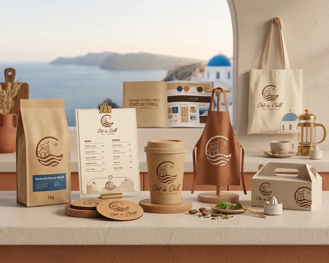


The identity meets the space.
Rounded thresholds, stone surfaces and archways echo the logo geometry in the real café. Architecture by KOA Architecture.
Chờ iu chill, Tea & Coffee
A client identity project completed in 2024.
- Brand and venue
- Chờ iu chill
- Brand identity, logo and menu
- Junkio Design
- Architecture
- KOA Architecture